Apartment List

Increase conversions by 57% by improving discoverability and reducing friction and dead ends on listing detail pages.

Highlight reel:

Timeline

H2 2024

Co-creators

I worked closely with my product partner in outlining the strategy and rooting our hypotheses in research. We came together with our product analyst counterpart to evaluate qualitative and quantitative data as we made decisions and aligned on iterations. I also collaborated closely with our engineering partners to strategize milestones and negotiate for the debt we wanted to tackle.

Methods

User research, Usability testing, Hotjar analysis, A/B testing
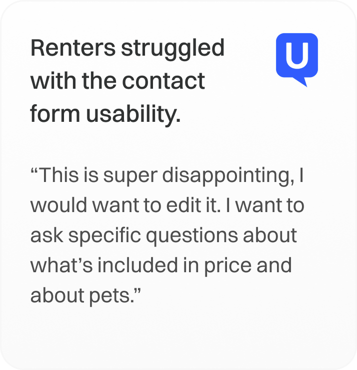
Problem

Listing detail pages lacked clear and flexible paths for renters to contact properties as well as opportunities for continued discovery.

1%

of renters were converting on listing pages.

Increased conversions by 29%

Reduced friction in multi-step contact flow by iterating with exposed form.

Increased mobile calls by 19%

Added property phone number for added flexibility in reaching out to properties.

Increased engagement by 700%

Improved usability of floorplan and unit cards to better indicate how to open and expand/collapse.

Background

Listing detail pages were heavily under-invested in so they weren’t great at converting renters.

Apartment List is a rental marketplace that advertises rental listings for renters to discover.

Historically, Apartment List relied on an onboarding entry point on all landing pages to funnel renters to register before showing results. This pushed helpful content renters were expecting beneath the fold.

Renters bounced because they were expecting to view listings. This signaled to Google that our UX and content were bad quality, which devastated our search ranking.

In 2022, the team removed the entry point from their pages to improve traffic but they neglected to ensure the pages could convert renters on their own. In 2024, my team stepped in to find opportunities.

Challenge

Renters don’t have confidence in making decisions on Apartment List.

By viewing a listing, you’ve established some level of intent. But data showed that renters don’t stay on the page for long and only 1% of renters were converting.

I ran an audit on the pages and they had significant tech and design debt from years of neglect. I looked into existing research and identified three themes where our conversion strategy was failing:

1

Renters don’t want to contact.

Renters didn’t want to contact via a third-party for privacy or efficiency concerns.

2

Renters struggle to contact.

Renters experience friction and unclear paths to get in touch with properties.

3

Renters are not finding matches.

We don’t help renters continue their discovery when they reach a dead end.

Before

Contacting properties was inflexible and required too many steps

Before

Form requirements and success messages were inconsistent and outdated

Before

Poor visual hierarchy led to issues with discoverability and usability

Approach

Boost engagement +409% with better discoverability and clarity.

To improve discoverability of the contact widget, I added elevation and stronger hierarchy with typography and button styles. I also simplified the actions and clarified the language.

I also wanted to address design debt where contact form inputs and success screens were inconsistent depending on the entry point on the page. My engineering partners and I wanted to unify all entry points to expose the same modal for quicker and cleaner iterations.

It was also an opportunity to simplify the modals to be more straightforward and clean up the visuals to be more consistent and branded.

Reduce friction and improve conversions by +29% with simpler flow.

While we saw an increase in engagement on the re-designed contact widget, we hypothesize the new contact flow introduced too much friction because we only saw a +2% increase in completions.

In a follow up iteration, we tested an exposed form with the updated styling, which saw a +29% increase in conversions. The form dynamically changes as the renter scrolls down the page to be relevant to their perceived intent.

Elevate property overview section with AI-generated summary and updated styling.

As an added SEO boost, my product partner suggested to introduce unique helpful content so we decided to add AI summaries to the property highlight section. These summaries pulled data from reviews and rare amenity data but needed to be refined to not mention demographics to comply with Fair Housing Laws.

I also saw an opportunity to expand the overview section to include relevant details beyond the address, while updating the icons and improving visual hierarchy for easy scanning.

Increase calls +19% on mobile by offering alternative methods.

For renters that didn’t want to reach out to a property through a third-party, I added the property’s phone number throughout the product. This led to a +19% increase in calls on mWeb.

We don’t have tracking in place to ‘register’ phone calls but because we use Twilio, if the renter ends up leasing with the same phone number then we get attribution.

Increase engagement +700% by improving usability of unit cards.

We tested adding alerts to retain renters that are interested in the property but don’t have matching units available. I placed the toggle within the pricing and availability section as well as in unit pages given its relevance.

But in testing, I observed renters struggling with the cards that open the unit pages. I saw it as an opportunity to clean up the UX (as well as the visual hierarchy) to help renters more easily access the unit page.

While we increased engagement with the pages by +700%, sign ups for the alerts remained low. We’re in a demand-constrained market so my hunch is this would be more relevant when it shifts.

Increase conversions by +9% by removing dead ends for discovery.

To reduce dead ends, we tested placing a carousel of similar listings where renters typically drop off as well as an entry point to take our onboarding questionnaire to view more relevant properties.

The legacy listing carousel pushed relevant content down the page. By moving them down we were able to elevate more helpful information and we saw a +9% increase in conversions with the onboarding questionnaire.

Reflection + next steps

Increased conversions +57% with better discoverability as well as reduced friction and dead ends.

This effort is testament to continuous learning and iteration: our strategy was informed by failures from an unrelated experiment I led in 2023, and we continued to learn from fusing quantitative and qualitative insights to give renters clear paths to move forward in their journey. We met renters where they are and accommodated different needs for taking the next step.

The investment of pushing past the dated linear funnel to enable personalized modes of entry led to a +57% increase in conversions on the page compared to before.

We’ve shipped the majority of features and are continuing to invest in optimizations in 2025.