Apartment List
Timeline
H2 2024
Co-creators
I worked with my product partner in outlining the strategy and rooting our hypotheses in research. I worked across growth, marketing, legal, and GTM to balance stakeholder considerations. I also collaborated with our engineering partners to assess technical limitations and determine strategy to scale up.
Methods
User research, Usability testing, Hotjar analysis, DiD testing
Problem
Renters leave Apartment List to find information to help them make a decision because we don’t have the information they need on our site.
$100M
of missed revenue from unattributed leases.
Increased traffic by 40%
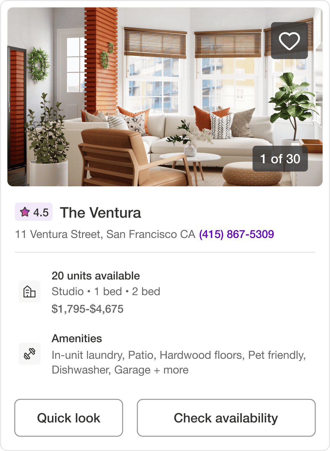
Added rating and review snippets to listing cards search result pages.
Increased conversions by 10%
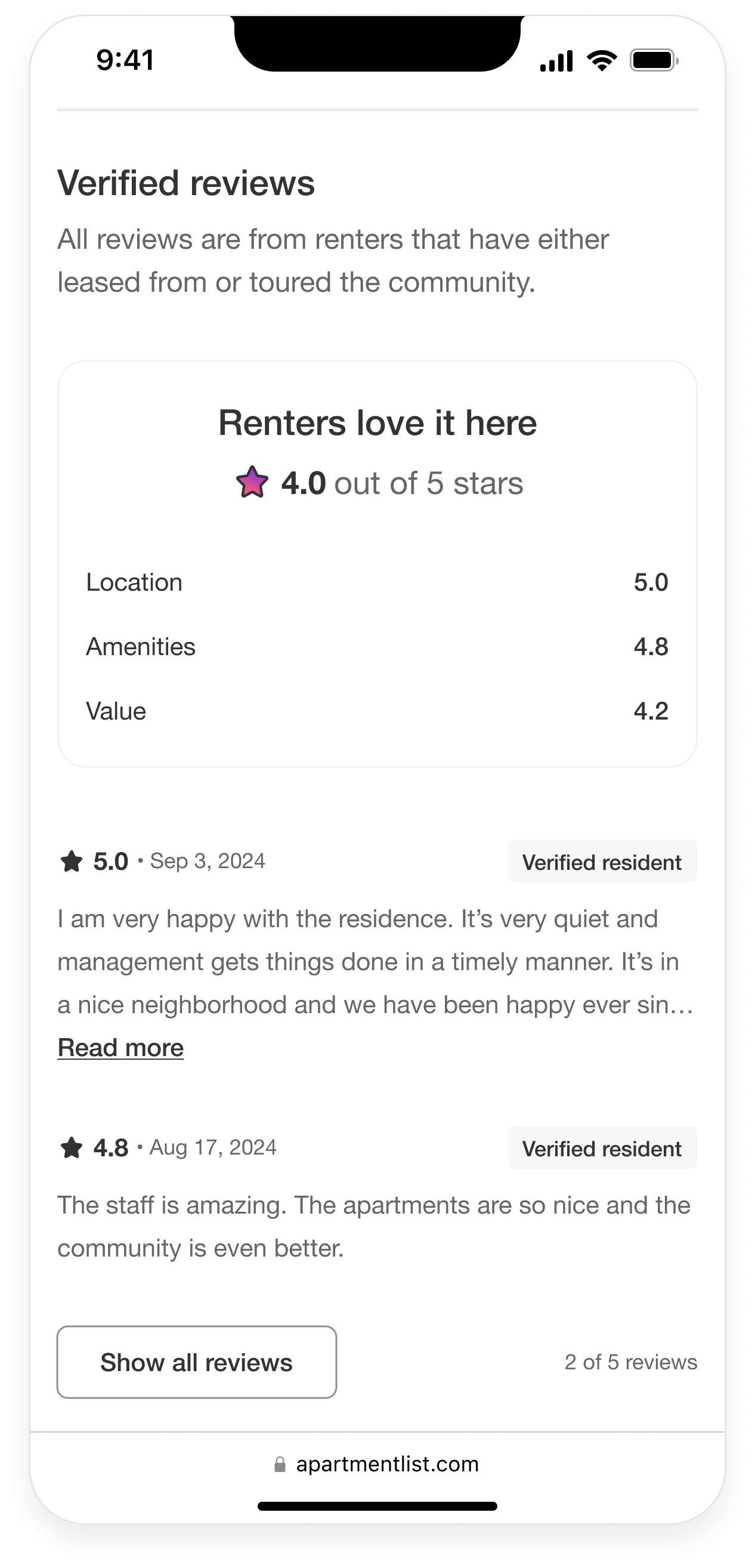
Added verified reviews with category highlights to listing pages.
Apartment List is a rental marketplace that advertises rental listings for renters to discover.
They have historically prioritized moving renters down funnel without publishing helpful content for their search. This not only has impacted our conversion rates but our organic traffic as well.
Our business model is Pay per Lease, so we are only successful when renters find an apartment to lease through us. Attribution is tracked via renters contacting properties on our site. So we want renters to make decisions to contact properties on our pages but, first, renters need to have enough information to reach out.
Only 1% of renters were taking action on our listing pages and we know from research that we’re missing decision-making information.
Renters have repeatedly told us how important reviews are in helping them make the final call but they have to leave our site in order to find them. Once they’ve left for a competitor or Google, they have little motivation to return.
We also lacked unique content that would signal to Google that we offer information that renters can't find anywhere else.
Adding user-generated content (UGC) would be an impactful way to boost rankings to achieve our traffic goals (we've seen competitor's VIX improve from it) which factored into our decision to add renter reviews to our listing pages.
Another team tested adding reviews to listings 5 years ago but they sent renters to Yelp to read them. Renters didn’t come back to make their decision.
With these learnings in mind, I knew that I wanted to host reviews on our pages to prevent renters from making a decision elsewhere.
My product partner and I both had conviction that reviews was the right priority for the team, especially given our traffic goals and the potential UGC had in helping improve traffic. But in conversations with different stakeholders, we were getting mixed reactions...not everyone was convinced.
We decided to host a workshop with our stakeholders to outline the opportunity we saw based on competitor data, customer discussions, and presented a vision to get people excited. We then included the entire team in brainstorming review collection and identified risks we'd need to assess. The two biggest risks we identified were response rate and review quality.
We convinced the team to run a quick email survey test in order to assess our concerns. At the end of our workshop we sent it out renters who leased through us the past year in Dallas, TX, which was our highest lease volume at the time.
We asked renters to rank the property on 8 categories and gave the option to provide a written response. My marketing partner and I consulted UXR to align on the categories that we know renters care about (e.g., location, amenities, maintenance, etc.).
With a 6% response rate and average rating of 4 (far exceeding our expectations) we got buy-in to expand collection across more metros and prioritize a solution on the H2 roadmap.
We received a request from our GTM team to only include positive reviews to help mitigate partner sentiment but per FTC regulations, we couldn't cherrypick reviews.
As a compromise, I only included badges advertising reviews on property listing cards that had an overall rating above 3.5 stars, while still allowing the renter to read all reviews on listings.
With this approach, we're highlighting properties that have higher ratings while not deterring renters from taking a second look at properties with lower ratings, especially considering our sample is still low at this stage (properties had on avg. 2 reviews).
In my vision I presented we wanted to showcase AI summaries and badging to highlight frequently mentioned topics and make it easier for renters to digest. In addition to data/technical constraints that impact scalability, with an avg. of 2 reviews per listing, this pattern didn’t make sense yet.
For an MVP, I chose to highlight a few of the survey category ratings to help summarize the holistic living experience in addition to the full text. My goal was for ratings to be well-rounded (e.g., not all renters raise value in responses but renters discuss management with a healthy dose of nuance).
I tested a prototype with 8 renters to gauge the helpfulness of the selected categories and the participants felt it met their expectations but 2 renters thought the number of reviews could be more prominent.
We received SEO feedback from a consultant to add keywords on listing cards to boost relevance with Google. So in a subsequent milestone, I pulled top reviews from each property to be highlighted on the card as a snippet.
But I also wanted to make it useful for renters (and properties). During a property empathy visit, I learned that property managers wished they could showcase what they are known for so that they could reach renters that are looking for those qualities (e.g., location, square footage).
So, I highlighted the category that property was rated highest for with the review snippet. This helps renters discover properties that are rated highly what they're looking for according to other renters.
In the test I ran with renters, I displayed 3 reviews for one property, which 6 out of 8 participants said wasn't enough (they would ideally want to see 10). I also showed an empty state for another property in order to assess how the renters navigated a dead end with an option to reach out to the property directly if they had questions.
Renters found the empty state untrustworthy and said they’d leave the page to look at reviews elsewhere. Given the negative feeling it gave renters and that it’d steer renters away from making their decision on our site, I pulled the empty state from the MVP so that we don’t advertise reviews on listings we don’t yet have data for.
Assumptions and observations from the study.
For testing, we used a Difference in Difference (DiD) analysis across several metros over the course of 4 weeks. We were limited in scope because we had other experiments running at the same time so we took a 10% haircut to account for testing limitations.
With the haircut, we saw a 40% increase in traffic and while our first test aimed to drive traffic, we saw a 10% increase in conversions on listing pages as well.
We shipped the MVP and are researching a tech solution to help us scale how we manage our data so that we can iterate towards the vision and will follow up with an A/B test to more accurately assess the conversion impact.
I think our vision state with the modifications we learned along the way in testing with renters and getting additional expert feedback is a much stronger design, one I wish I had explored sooner if I had spent a little more time designing outside of the box of what we were currently working with for the MVP.